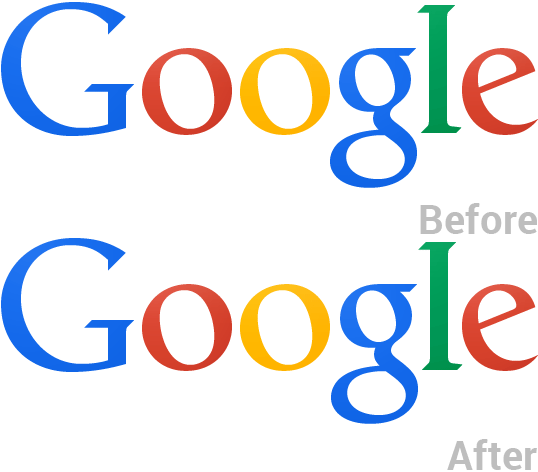
Google has updated its logo without blowing trumpets about it and that’s understandable considering that the update actually shifts the letters ‘g’ and ‘l’ in the logo by one pixel each.
First noticed by avid Redditors (here), the change is rather minuscule with the small ‘g’ shifted to the right by one pixel and ‘l’ shifted down and to right by one pixel to align with the bottom of ‘e’. The change from Google seems to be for improving the readability and decipherability of its logo.
The latest change is the third in the last decade and one of those that hasn’t been publicly announced yet. Chances are Google won’t really make a public statement about the update considering that it is really a tiny change.
The logo was updated sometime over the bank holiday weekend and that could be one of the reasons why there hasn’t been a hype about it.

